see url The original posters for the Disneyland Attractions have always struck me as nothing shy of brilliant. They have that vintage classic tone, yet very current feel to them. The posters tell the stories that the attractions tell, which are also versions of the movies (that are also versions of fairytales and/or other stories). It’s basically a wormhole of a stories telling the stories of stories, that ends at the posters. The posters tell exactly the same story as the original, without watering it down. Very consistent. The posters are always active and you can feel the energy of the ride and what type of attraction and adventure you are in store for, just by looking at the poster itself.
Buy Xanax Online Without Prescription I chose the MATTERHORN because it is one of my favorite attractions at Disneyland. Also, the poster is very blue, and I, like the rest of the world, love this color.
get link SIMPLICITY OF STORY, HIERARCHY & CLARITY OF DESIGN
The story of this poster is that you are going on a fast-paced adventure through this snow-covered mountain and it is going to be a blast. (It fails to mention the part where your back will hurt because it is quite a jerky ride.)
Outside of the obvious visual image of a mountain and a bobsled, the colors really give away the story’s sense of adventure and set the https://www.beyondagencyprofits.com/about-bap/ hierarchy of the image. The blue-white-gray background gives off a cool tone, expressing the brisk nature of the ride, where the yellow and red bobsleds show the action, the fire that pops off of the cool, relaxed tones of the scenery. Your eyes are forced to follow the action of the bobsled down the mountain, and then back up to the top to see where you actually are. It is very clear. You know where you are going and where you came from, and know exactly what you are in store for. (NOTE: The attraction originally debuted in 1959 where there was no monster inside the mountain, which is clearly shown in this poster. The Abominable Snowman was not added until the 1970s. So from the perspective of 1959-1978, this poster is a clear visual representation of the attraction’s story.)
The yellow does mix in the title and the gray/blue/white scheme mixes in with the bobsled and sledders, bringing the marriage of the fire and ice together perfectly. (It also looks like you will come out with a nice tan at the end of this attraction, but that just might be the result of being in Southern California in general.)

The flow of the action follows the firey colors down the cool colors. There is a clear hierarchy and flow.
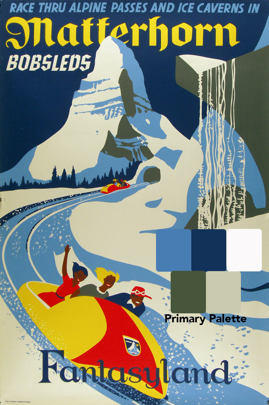
Primary Color Scheme: Cool Colors

Secondary Color Scheme: Fire Colors
Buy Soma 350 Mg Online TYPOGRAPHY
There appear to be 3 distinct fonts appearing in this poster, each saying something different and mapping the attraction.
“Race through Alpine Passes and Ice Caverns in:” sets the stage for the action. This sentence is italicized pushing the action forward toward the next words in a different font, “Matterhorn Bobsleds.” These words are the main attraction, setting the stage for the cultural location of the attraction, the Alps. The typeface expresses the theme of what we perceive of that cultural area. And finally, we arrive down at the bottom, “Fantasyland,” in the official typeface of the actual location of the attraction at Disneyland. The fonts take us from where you sit (“ride throug….”), to the Alps, (“Matterhorn Bobsled” font) to Fantasyland, the physical location of the attraction.
The exact fonts I cannot directly speak to, however this blog provides a great explanation that they are a combination of Zolpidem Buy Online Serifs and Valium 10Mg Buy Online Sans Serifs (italicized). “Fantasyland” has Clonazepam Purchase Online Blackletter typeface influence whereas the “Matterhorn Bobsleds” features characteristics of https://www.jacobysaustin.com/events/ Uncial and Vicodin Online Purchase Jackboot.
see SYSTEM
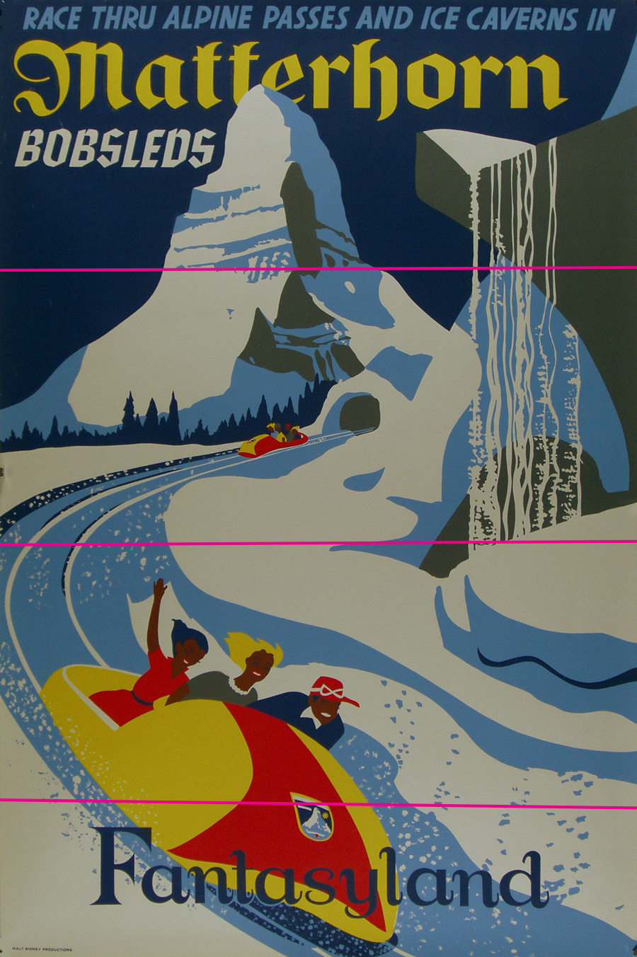
The story of the poster is divided into four main sections horizontally: the top wording, the smaller bobsled, the larger bobsled, and the go to site Fantasyland wording. You could argue that the bottom portion is just one section (large bobsled and Buy Xanax Online Overnight Fantasyland) and I would agree with that as well. The division is the forced perspective of the images.
Division of 3:
The far top, tall, small, in the distance look of the peak of the Matterhorn, followed by the bottom of the mountain, still far away, but larger, ending with the close-up of the action.
Division of 4:
You could also look at is as being in four parts, just giving that final line above Purchase Valium Online Fantasyland a reference point and location. Going back to the font and “map” idea, the bobsleds are a small part of the Matterhorn, and the font is smaller, respectively. And the Matterhorn is just a small portion of the greater https://www.parolacce.org/1233521495418_f/ Fantasyland, and here we see follow Fantasyland getting a bit more attention in this image.
We also see that all of the main action is happening on the left side of the screen between the titles. There does seem to be a vertical split here.The firey colors popping out and the action is spread out between the top of the mountain and the bottom of the mountain. The forced perspective makes the left side seem very spread out. On the right the action happens with the cool colors, in the form of the frozen waterfall. The graphics seem a bit more cramped on the right, as the image is closer up and not as spread out.

Original Image
Division of 4 (or 3 if you remove the bottom line)

Vertical Division
Zolpidem 5Mg Order Online REFERENCES
https://vepca.files.wordpress.com/2010/04/matterhorn-fantasyland.jpg
https://en.wikipedia.org/wiki/Matterhorn_Bobsleds
http://disneydesignerland.blogspot.com/2011/03/matterhorn-bobsleds.html
Leave a Reply