
Assignment 1: What is UX?
Order Soma Online Design begins with a design challenge. And within this challenge exist principles of design that Donald Norman lays out for us. As I examine designs and products in my real world, I am using Norman’s principles and psychological concepts to analyze why some designs are near perfect and why others fall short of usable.
https://thesentinelgroup.com/medical-devices/ Buy Tramadol 100 Mg Online DESIGN PRINCIPLES AND CONCEPTS
Visibility – the use of the design/product should be intuitive by virtue of the design, and not take “an engineering degree from MIT to work…”
-includes mapping
Affordance – the properties of the materials that exhibit how the item is used. (Also is somewhat of a limitation)
Mental Models – design models vs. user models
source site Tramadol 50 Mg Price GOOD DESIGN
The Electric Tea Kettle
I recently made the switch from the stove-top kettle to the electronic kettle, and I am very pleased with this decision. I made this change because I was tired of how dirty the kettle would get from sitting on the stove. I also was able to shop in my aunt’s basement and found the perfect solution – the ever visually pleasing, easy to operate, Huntington Beach Candy Apple Electric Kettle. All I need to do is press down on a lever, it turns red, I wait for the water to boil, poor the water and the interaction is done (and the water remains hot so in ten minutes when I need more, I don’t have to wait the entire length of time to reheat the remaining water).
Clonazepam Purchase Online Why is this a good design? The design model and the user’s model match. The affordance of the lever makes me intuitively see the visibility of the device. I press it down. It turns red. That must mean that it is in use working to heat the water that I so desperately want in my tea. I don’t have to think about it. It’s an almost automatic, natural interaction. The design is also small and compact and attractive in color and shape. (Please note that I did manage to steam-burn my hands with this kettle recently by not closing the lid completely. This was completely user error, not a design error. However, the lid did look like it was secured completely, as there is no visual difference between a secure lid closure and a just the lid casually covering the top.)
source link ANOTHER EXAMPLE of GOOD DESIGN
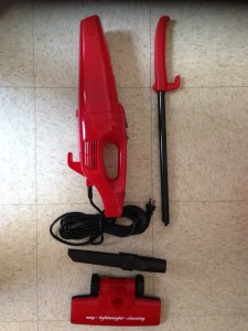
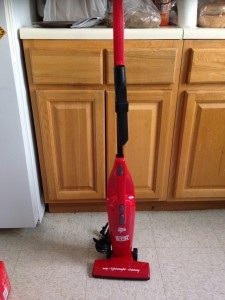
This mini upright vacuum is the perfect example of good design in a nutshell. It can be put together and used without the need to look at directions. Visibility: HIGH.
see here BAD DESIGN: “The Paradox of Technology”
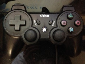
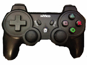
I use Playstation to navigate Netflix, DVDs and other video sources. However, I always have trouble with this navigation because of the design of the remote control. It is designed as a universal remote for world users, with buttons and icons that appear to invoke the idea of visibility, but in actual use, the buttons are unclear and I don’t know how to intuitively start, rewind, pause, end, return, go to the main menu, etc.
follow link Playstation 3 Remote Control
source url For example, to me, X means stop, but it isn’t in red-and red is the universal color for stop. Triangle is green. Does that mean go? Are the up/down rewind/fast-forward functionalities attached to the cross button on the left or to the shapes on the right? And does “H” for home mean back to the main menu? How do I get to the main menu of this particular program, not HOME to the main console menu? Also, I have spend a lot of time on the Playstation Netflix App just trying to figure out how to just search for a movie. Perhaps there should be a button that just offers the search feature.
follow The remote control reminds me of the radio example provided by Norman:
Order Lyrica Online The modern sets are technologically superior, offering higher quality sound, better reception, and enhanced capability. But what good is the technology if it is too complex to use.
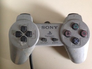
Take look at an older incarnation of the Playstation remote control. The up/down, left and right buttons are clearly labeled. We know how to select and what to press to start. Although the shape icons are not as clear, I remember not having trouble figuring their uses out in context of the games.
Original Playstation Remote
The lack of visibility in the current remote control lies in the interaction between the remote and the games and apps played on the device itself. As the games and programs become more complex, more involved, more options and combinations are needed on the remote. This is the “paradox of technology”. One who has been playing this game system from version one through the current version 4, picks up on the usage quickly. They know. It is visible to them. But for me, I just want to watch a movie. I don’t want to lead an army to the destruction of an alien squid trying to takeover the dystopian society on screen. I don’t need all of those buttons.
However, I would make some minor changes, to make it more obvious to the not-so-avid gamer, who just wants basic functionality.
The Remote Remodel
After playing with the remote, it appears as though the “X” button also means “select” and is positioned at the most comfortable place for the thumb. Since X and red mean NO, I’ve moved the X over, changed it to red and move the circle to the “select” aka “let’s go” thumb convenience area and changed it to green.
It turns out in the context of my usage of the console, the circular joysticks in the bottom center AND the cross button on the left have the same exact functionality. And the top buttons seem to have no meaning, as well as the square and triangle.
ANOTHER BAD EXAMPLE of DESIGN
This example might not be bad in the traditional sense, as it has visibility, it is clear how to use it. The issue I have with this is that I don’t want to use it and wonder why someone would design something like this.
The scene: You are walking through Times Square, one of the busiest intersections of the world and one of the filthiest places in the area outside of a public restroom at a bus stop. You have some trash that you need to dispose of, as there is no storage space on your person for said trash. And there you see it, the mirage of garbage disposal, like a fountain in the desert:

You go to drop your trash in the bin and…what’s this? A handle? Why is there a handle solely on the trash and not on the paper or cans/bottles bins? Why do you have to touch a handle that has been marked with trash germs from around the city and world? So you look for a sensor, perhaps it opens automatically like a door. No, no that’s not there. How about hand sanitizer if you must touch it? No, not that either. So you hide the trash or litter and continue on in frustration.
What I am saying is, this trash can design is not for the germaphobe. Seeing this actually made me pretty angry. I carried my garbage for hours. Why should I be forced to touch the garbage can? Unless this particular design is to protect from firearms and weaponry from detonating, it needs to change. (It reminded me of 11 years ago when I was living in Tokyo and for some reason there was never any litter, but never any garbage. So for hours and days and weeks, I’d walk around with trash stuffed in my pockets and clothing. )
Solution 1: Keep the visual design the same as above, just add an ultrasonic distance sensor so the lid opens upon being approached.
Solution 2: 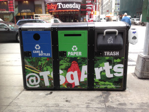
Add a Purell dispenser on the side.

Remove the need for the handle completely, and keep the entrance for trash wide open.
https://www.52editions.com/promotions/ UBER
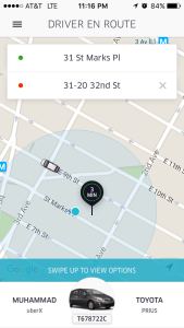
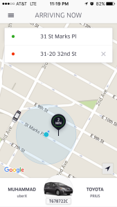
This was my first time using Uber. Although I had tinkered with it a few years back, this was my first official use, going through the process. Now, from my perspective, it seemed designed for people who already knew how to use it.
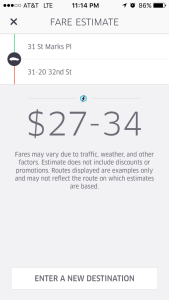
At first, the app asked me to check the rate before I ordered. It was not that clear how to do when that notice popped up. Also I was afraid to check anything for fear of accidentally ordering a car.
I scanned in my card and only showed the last 4 digits. How do I know that the rest of the numbers scanned correctly?
Finally I did a price check, put my phone down for less than a minute. When I went to click request/accept a box came up saying that the rate expired. Another box popped up that I pressed too quickly to get it out of the way. All I remember was that I had to promise to pay more at a rate of $9.98.
Positives:
The experience in the car was great. I had a lovely driver. It was clean. I could see when he was arriving, to know how long I had to say my goodbyes and get my coat on. This is perfect for planning exits, instead of wandering around East Village and parts of the city waiting endlessly for a taxi that is not coming. In non surge times, I imagine it is better financially.
Once I arrived at my destination, I exited my vehicle and walked toward my door. However I did not see a confirmation of payment and thought perhaps I walked out without paying. So I went back to the car and questioned the driver with a thumbs up. He nodded and drove off. And then the bill appeared in the history section of my app. This is when I remembered why I never took to Uber in the past. Unless there is heavy traffic, a taxi is the better option financially, although Uber provides a better overall experience from being able to order, see a specific time and track your journey throughout the process.
https://hymnsandhome.com/recipes-3/ DOMINOS
(Or, the establishment formerly known as Dominos Pizza)
The user experience was superb and straight forward. Not only that, there was constant feedback from the interface. For example, when I added a topping, it showed me the changes immediately and visually. 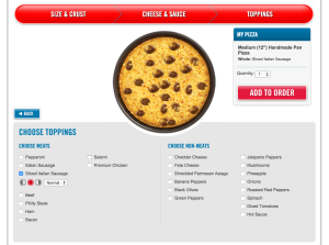
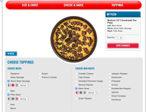
Actually, this made me want to order more so I could continue to get positive feedback. Like a game! The design is also set up to re-ask questions along the ordering journey in case you missed an add-on. I didn’t select extra cheese, but in the check out flow a pop up asked me if I wanted to just in case.
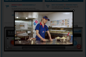
The waiting process is also fun. The user can see in real time the stage of their pizza and not wonder wether or not the order went through, how much longer they have to wait, and if they have time to shower between now and arrival. The videos are a fabulous touch. And the ticker underneath is so detailed right down to the time and name of person who put your pizza in the oven. (Granted, we are made to believe this story that they are telling us. Who is to really know if all of this is true and not a programmed series of events. For all I know, Lance is really Cal, and Cal is too busy checking his instagram to put the dough on the counter.)

![]()
However, I choose to be a believer!
One little design snafu: the user’s mental model of the system and the design model don’t match when it comes to adding in the tip. In almost all delivery service nowadays (okay, Seamless.com), the tip is added in before the sale is complete, so much like Uber, the delivery/drop off ends and no money is exchanged by hand. However, Domino’s breaks that modern tradition and the tip must be paid upon delivery. This caused a bit of an inconvenience and confusion at delivery. Made the the experience a little less fluid.
This design is beneficial for both the user and the company, as we get to enjoy this experience and they get more money. This is a design win based on visibility and feedback. Also note – there was a $2.50 delivery fee. Of course! That is where they get you. But hey, sometimes it is worth the extra money to have a better experience.
Too bad their pizza isn’t as good as their user experience!
click here STORY TIME SIDE BAR
The projector example given in the text reminds me of an experience I had over the summer at a random stop in the Highlands of Scotland. My friend and I pulled into a rest area in this town called Luss. It was this cute little village on the bank Loch Lomond. As we explored we ended up inside of a small, historical church –The Church of Luss. (You’re probably wondering where this is going now, as was I at the time.) As we entered the church, a wee older man was very excited and insisted that we stay for the historical/educational presentation on the Church and town’s history. Sure. We were in no rush outside of the parking meter. We sit in the pew and wait. And wait. The wee man was struggling with getting the large projector screen down. So he called for another man. And in comes another man, but it wasn’t that other man initially called. Neither could get this device to work. Finally the original “another man” arrived and the projector came down. The presentation began. And the projector went up again. Finally, after much struggle with interaction design as it was with this particular projector, the presentation began. And like a scene out of an Epcot attraction, relics around the church began to light up in accordance with the visuals on the screen. The experience itself was wonderful. However, the presentation came to life with the difficulty of the projector and its design follies. Sometimes poor design leads to greater life interactions. I would like to call this the Purchase Tramadol Without Prescription Law of Conservation of Interaction: Interaction is neither created or destroyed, but changes/switches from digital to analog. (Based on the law of conservation of energy/mass.)
Katherine
Thanks for the thoughtful post Angela, some very good insight here.
angela
Thank you Katherine. I was able to add in the Dominos experience!
Katherine
The Church of Luss sounds like a wonderful experience. Too many museum exhibits are like that though – you can’t figure out how to turn them on. Like you time square garbage sensor, couldn’t it know you are there, though the experience should be optional not forced on all visitors.
angela
A way to give the user the option to or to not touch the bin – great idea!
I do have to say that although on the outside the Luss Church experience seemed like a UX-fail, the whole thing from folly to finish painted the experience all the more charming. If the process had worked initially, the story wouldn’t have been as personal of an experience. #lostinUX