Forget the eyes – Business cards are the windows to the soul. Which is why the branding and creative process leading up to the deciding to print the almighty cards can take years. (Can we discuss the elephant in the room at how aggressive Joel Bauer is, and how it took him 25 years to make a $4-a-pop business card – you’d think in all that time there would have been a way to make it cost less…)
While working on my business cards, I thought it would be interesting to take a look back over my business card history since college to track the progression and see some similarities. 
Having been involved with Japan and Japanese related companies, my relationship with business cards began early on. I could never be without one. And I started to categorize and label all of the ones I would receive in exchange for my own. It is quite of hand, and I have since resorted to stacking and dust collecting as my organization tool of choice.
Here they all are, all but the card from my time in Real Estate, my most recent job, which oddly I cannot find. The personalized cards that I made as amendments to corporate business cards share the same blue color spectrum. The corners when from sharp to round. The fonts changed from more traditional to type writer style, to the a more fun, sans serif, rounded experience. I wonder why it took me so long to realize that I was going for the fun thing. Basically what I am learning is ROUND is FUN and POINTY is SQUARE!

When I was in college I interned for the Maureen and Mike Mansfield Foundation. Great business cards. Fabulous logo.

I made these very basic (is that clip art?) business cards when I was teaching English in Japan. So much I would change about these now.

These were the two Japanese media companies that I worked for . The Yomiuri Shimbin, one that is very old and traditional and widely known, and Marcom, a small, much newer company on the production and “creative” side of things.
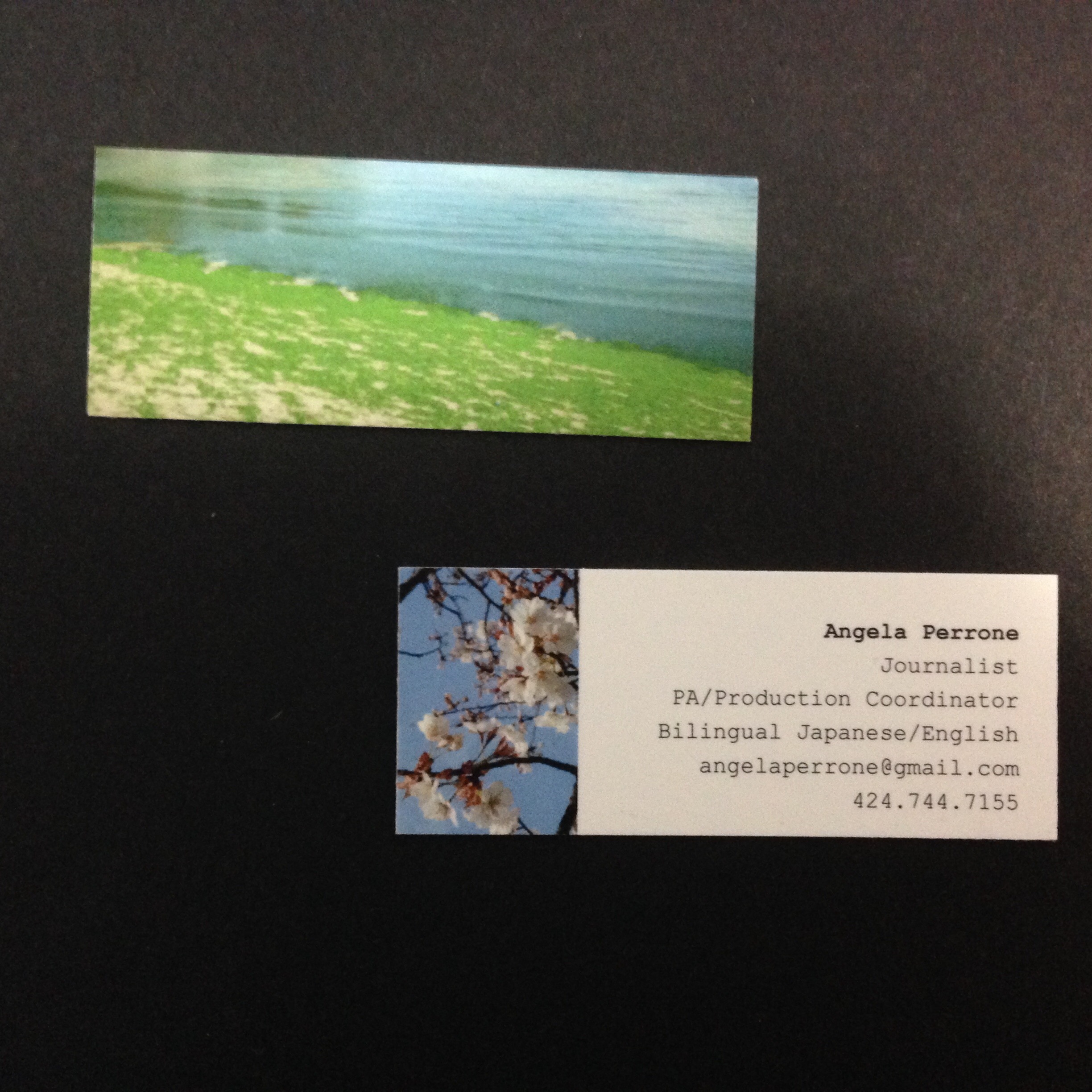
When I discovered moo.com I decided to make the multi-photo, mini card size in order to stand out.

This is the most recent incarnation of my personal card. I tried to fit as much on it as possible, to cover the many hats that I can wear. I do regret some of this copy, but hey, I am trying to be different.
I was trying to go for the minimalist look and have the eye focus on the logo. I switched the colors on the “a” and “p” because the brighter blue popped more and that color should be on the letter that I want to stand out most, the “a”. I ended up using the Quicksand Light/Regular font, which Jesse had introduced us all to. It was the perfect round, sans serif that I was looking for – playful yet professional. Then I was inspired by the die-cut business cards. I used this video as a guide for setting up the grid.
Here is the plan:

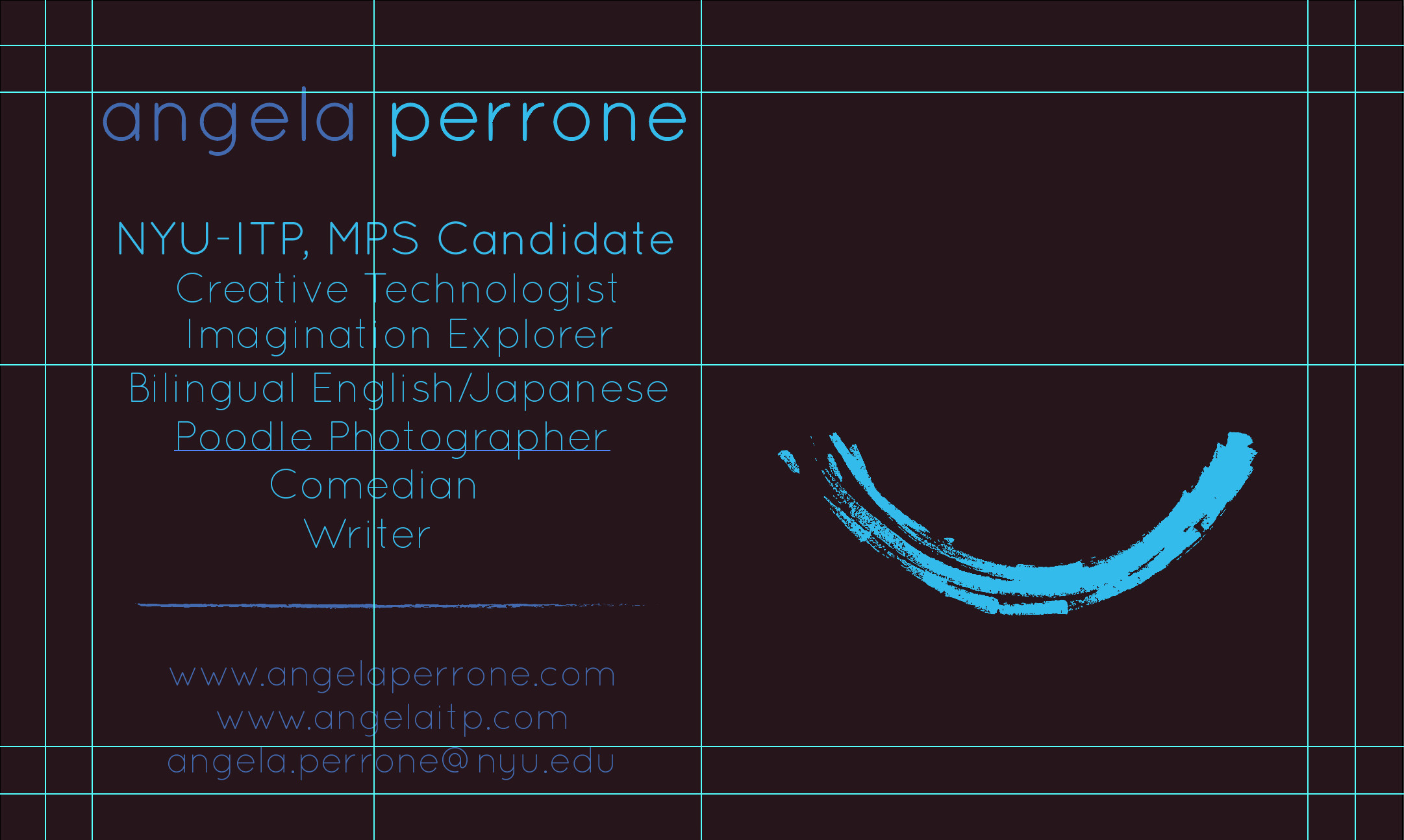
I am going to somehow magically cut out two eyes for the holes, so on the back, a smiley face is created (fingers can be used as eyes). This will represent the playful, comedy perspective that is subtle and still within the realm of this “creative technologist” side.


Leave a Reply